Branding. Web Design.
The Rum Company
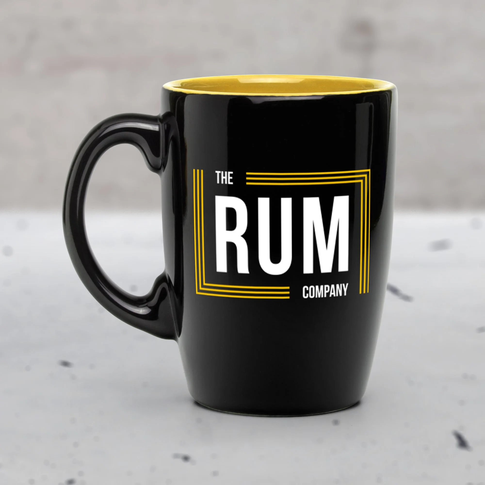
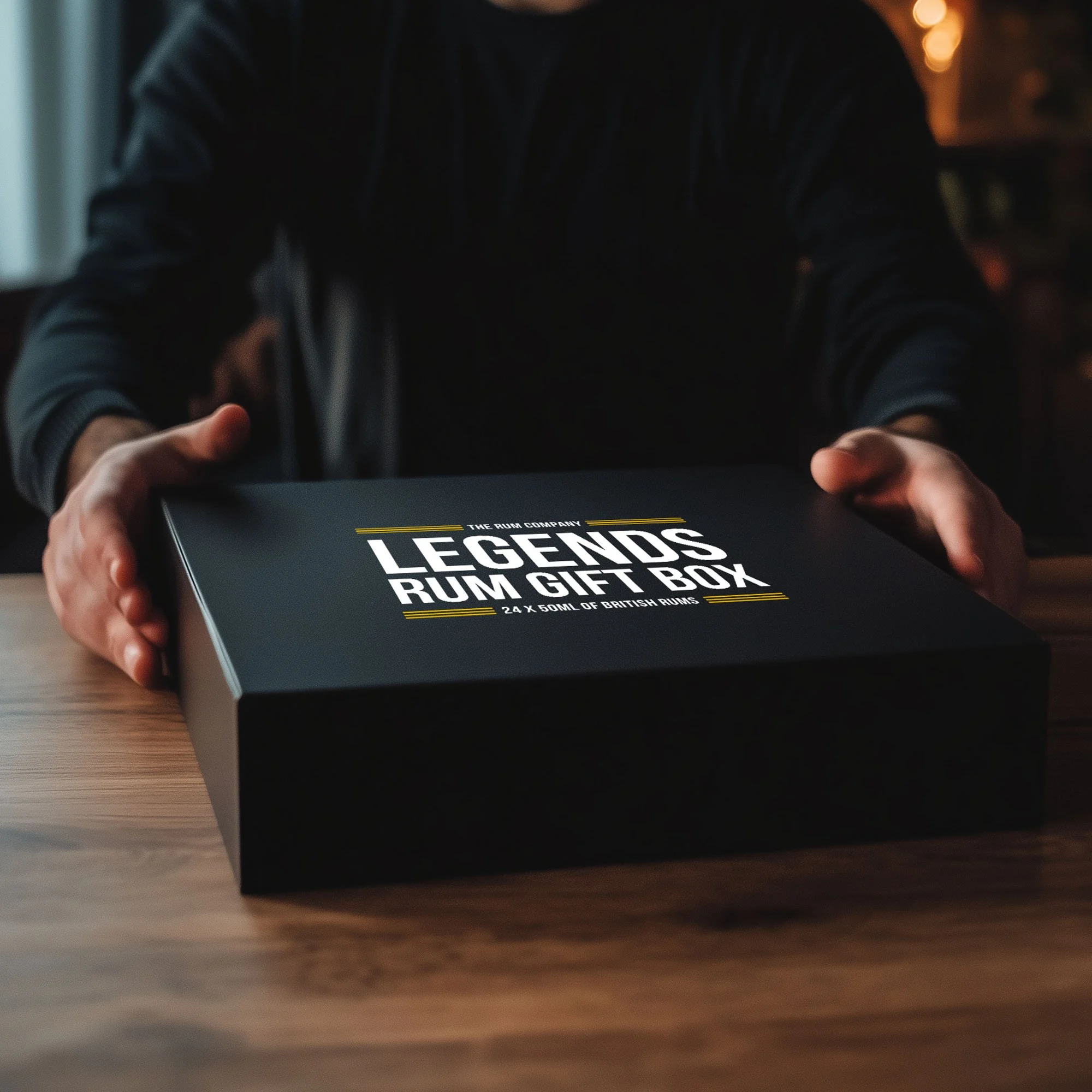
The Rum Company was the first time I’d taken on full brand development for my own business. Having spent years designing for others, this was a chance to apply my creative process to something entirely my own. I needed a bold yet simple identity. Something distinctive enough to stand out in the saturated spirits market, but flexible enough to grow with the brand. I kept the branding deliberately minimal: clean typography, subtle textures, and a rich dark palette to convey a sense of edge and attitude without feeling forced. Every visual decision was guided by instinct and experience, but also by a desire to stay true to what felt authentic.
When it came to the website, I treated it like a masterclass in e-commerce best practice. From clear product presentation and strong call-to-action hierarchy, to mobile optimisation, and trust-building signals, I designed every element to serve a purpose. The dark aesthetic created the mood I wanted, but the user journey had to be frictionless, with conversion in mind at every step. I followed gold-standard UX principles, including simple navigation, persuasive product descriptions, upsell opportunities, and an intuitive checkout flow. The result was a sleek, high-performing online store that reflected the personality of the brand while doing the heavy lifting behind the scenes.